Case study · 2025
ConceptChrome Hearts Concept
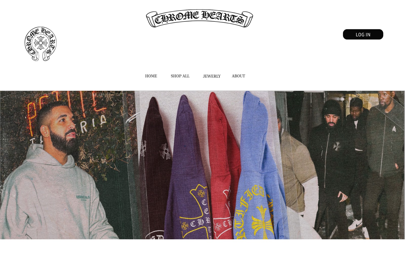
An e-commerce concept for the luxury brand Chrome Hearts — five desktop pages and a clickable Figma prototype with hover states and a colour-shifting best-seller carousel. Unofficial, not affiliated with the brand.
- Role
- UI/UX design · Concept project
- Year
- 2025
- Stack
- Figma, Component variants, Interactive prototype
01
Project Overview
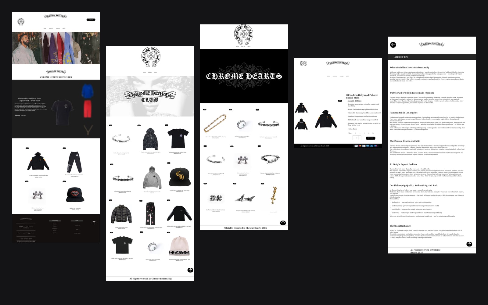
An unofficial e-commerce concept for Chrome Hearts, the Los Angeles luxury brand known for gothic silver jewellery and streetwear. I designed five desktop pages in Figma — home, shop all, jewellery, product detail and about — and connected them into a clickable prototype with page navigation, hover states and a colour-shifting best-seller carousel. It's a personal design project, not affiliated with the brand.
02
Problem
Luxury streetwear sells on attitude, but an online store still has to make browsing, comparing and buying effortless. The challenge was to carry the brand's dark, gothic identity into a shop without letting the styling get in the way of products, prices and the path to checkout.
03
Solution
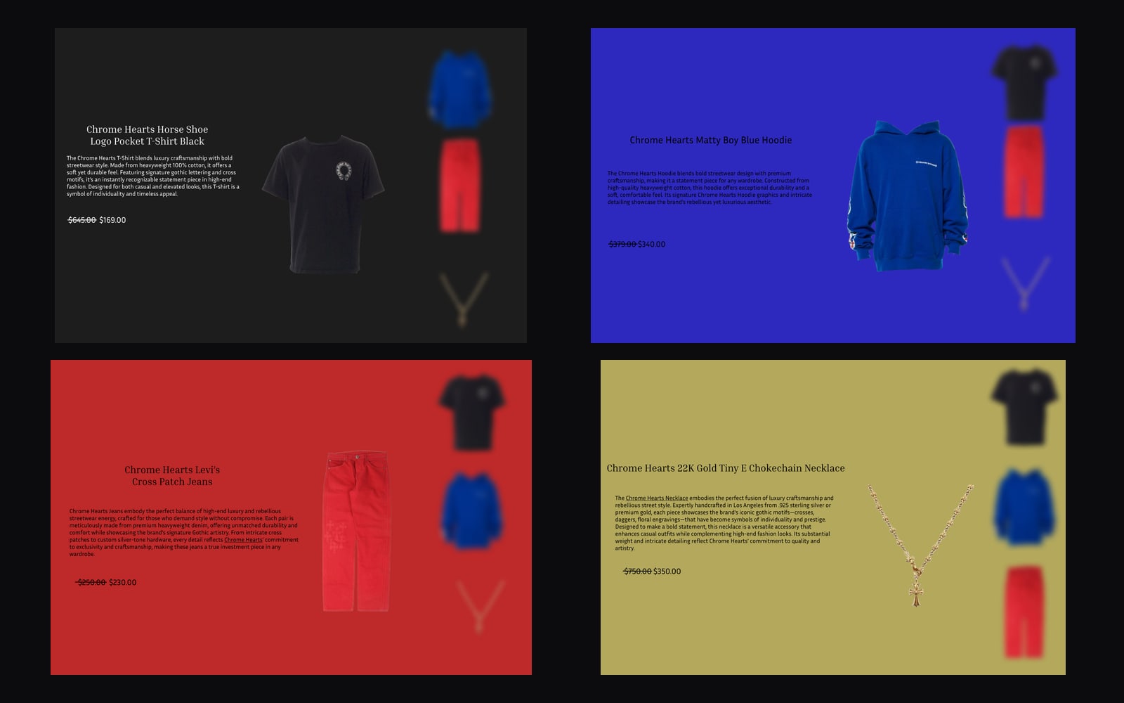
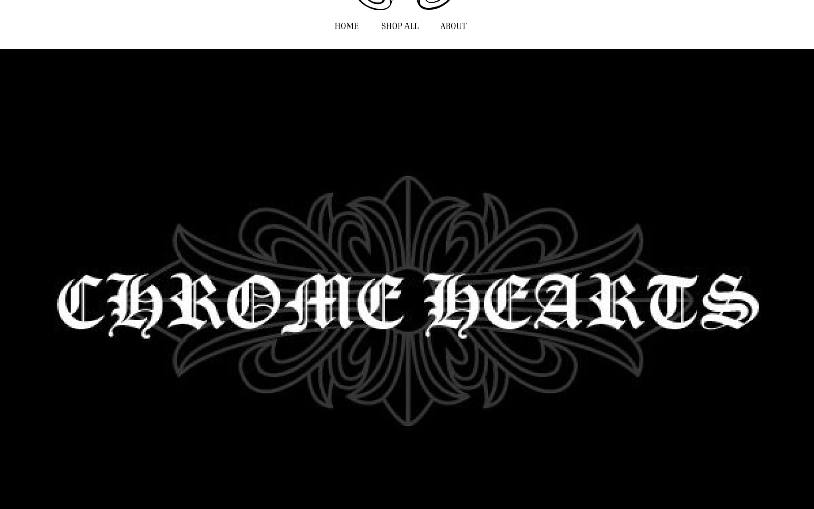
A strict black-and-white system — the gothic wordmark, Inria Serif headings and Inria Sans body copy — so product photography carries all the colour. Every product card follows the same pattern, and colour appears only where it sells: the best-seller carousel repaints its whole section to match the featured piece.
04
My Role
UI/UX design · Concept project
- Page structure and navigation for five desktop pages
- Visual direction: monochrome palette, gothic wordmark, serif and sans pairing
- Reusable product cards and carousel slides built as component variants
- Clickable prototype with page links, hover states and scroll-to-top
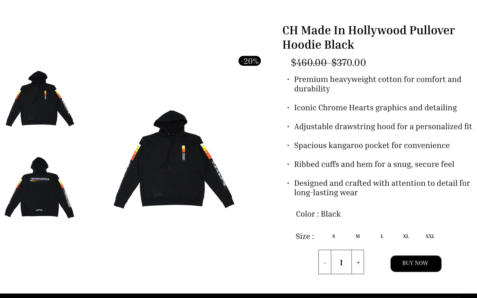
- Product detail layout with gallery, size and quantity selectors
- Long-form About page for the brand story
05
Tech Stack
06
Key Features
01
Colour-shifting best seller
Four carousel states — black, cobalt, red and gold — each repainting the section to match the featured product, with the next pieces blurred at the side.
02
Consistent product cards
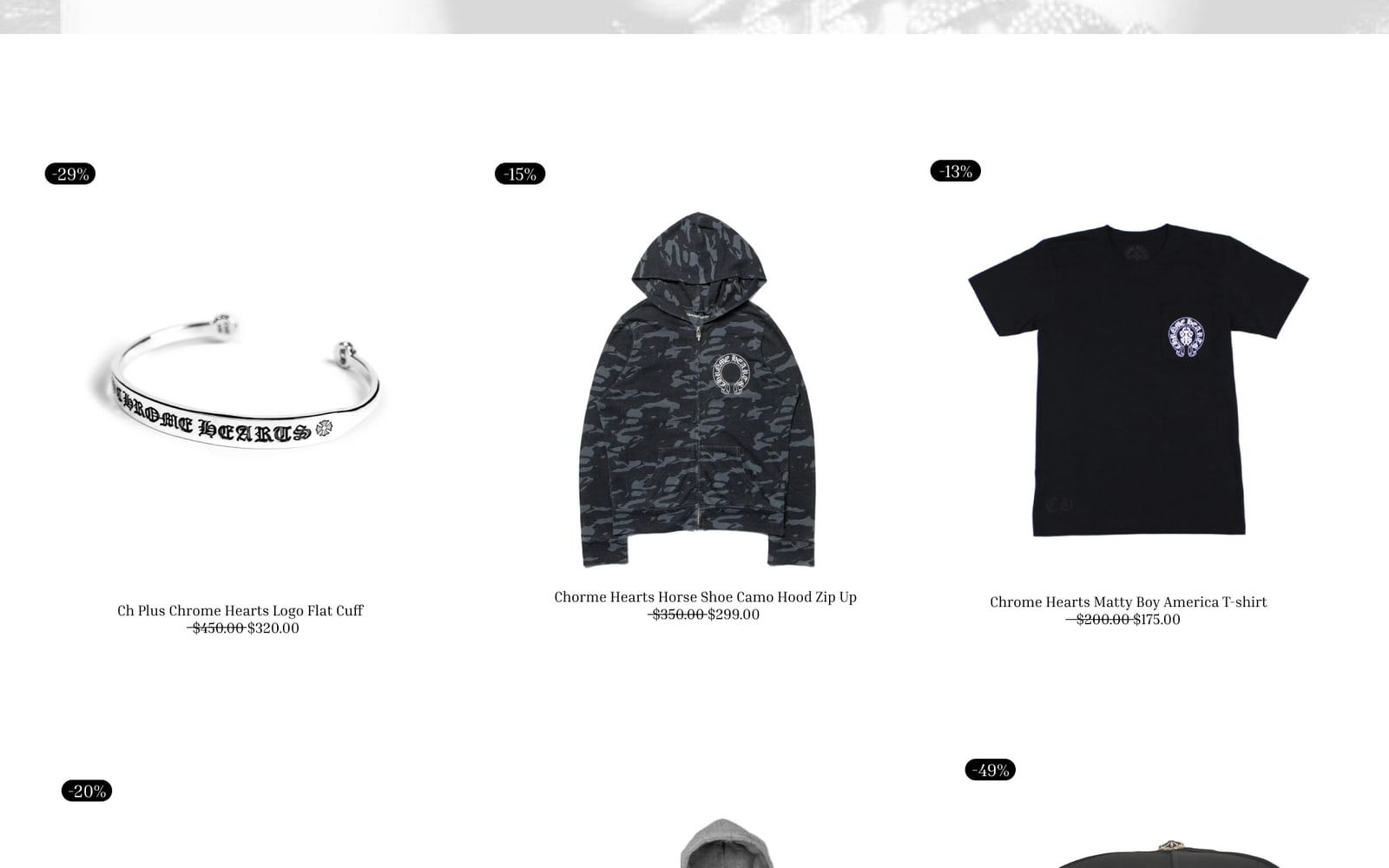
Discount badge, product name, struck-through price and sale price sit in the same place on every card across the shop and jewellery pages.
03
Hover states
Product cards switch to a second state on hover, built as component variants so every card behaves the same way.
04
Clickable prototype
Links between every page, a back button, scroll-to-top and drag interactions, so the flow can be tested like a real store.
05
Product detail page
Image gallery, discount badge, feature list, colour, S–XXL size selector, quantity stepper and a single Buy now call to action.
06
Brand storytelling
An About page covering the brand's story, craftsmanship and philosophy, set in the same serif and monochrome system.
07
Screenshots
08
Challenges
- 01
Letting the product lead
Heavy black blocks and gothic lettering can overwhelm a page. Generous white space and a monochrome palette keep the focus on the product photography.
- 02
Colour without chaos
Strong colour is confined to one section and always taken from the featured product, so it draws attention without breaking the brand.
- 03
Components that scale
35 component sets keep cards and carousel slides consistent, so a new product means a new variant rather than a redrawn layout.
09
What I Learned
- How a strong brand identity translates into a usable shop layout.
- Building component variants and interactive states in Figma.
- Prototyping a flow so it can be tested before any code is written.
- Using colour sparingly so it guides attention instead of competing for it.
10
Result
A complete, clickable desktop prototype of a luxury store — five connected pages built from reusable components, ready to hand over for development.
- Pages
- 5
- Component sets
- 35
- Carousel colourways
- 4
Next mission
AI Website Auditor
Turns any URL into a prioritised improvement plan: 47 checks across SEO, performance, accessibility and usability, explained in plain English by Claude.
Read case study